

Strategic AssessmentProcess OptimizationBrand Guidelines
Amber Art + Design is a multidisciplinary art and design collective creating work at the intersection of public art, culture, and community. Rooted in collaboration, Amber works across design, fabrication, education, consultation, and community engagement to create thoughtful experiences shaped by the people and places they serve.
This visual identity reflects expressive yet grounded, accessible yet distinct, and flexible enough to move between neighborhoods, cultural institutions, educational spaces, and the public realm. At its core, the brand represents creativity as a shared process—one that creates space for storytelling, participation, connection, and lasting cultural impact.

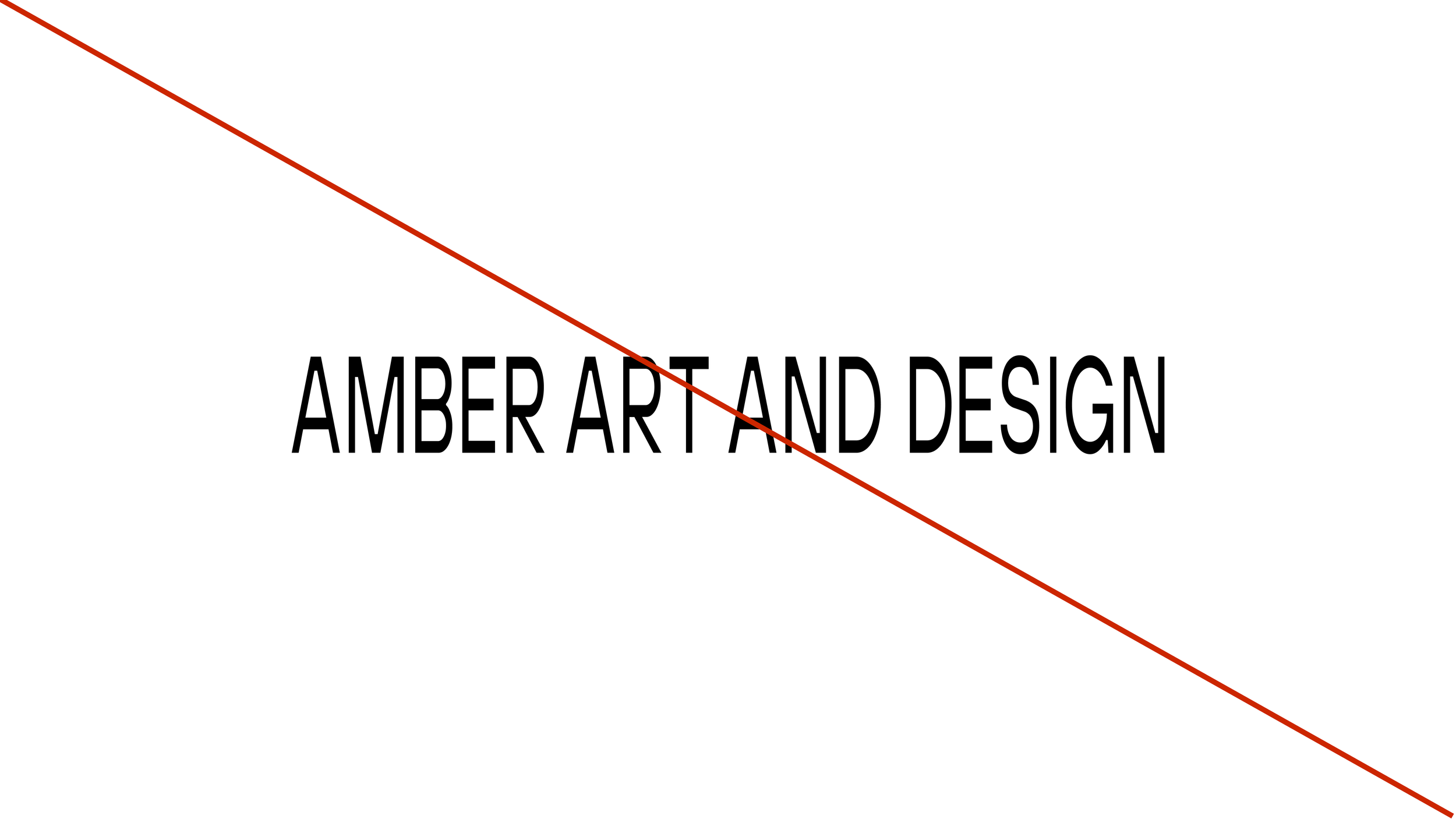
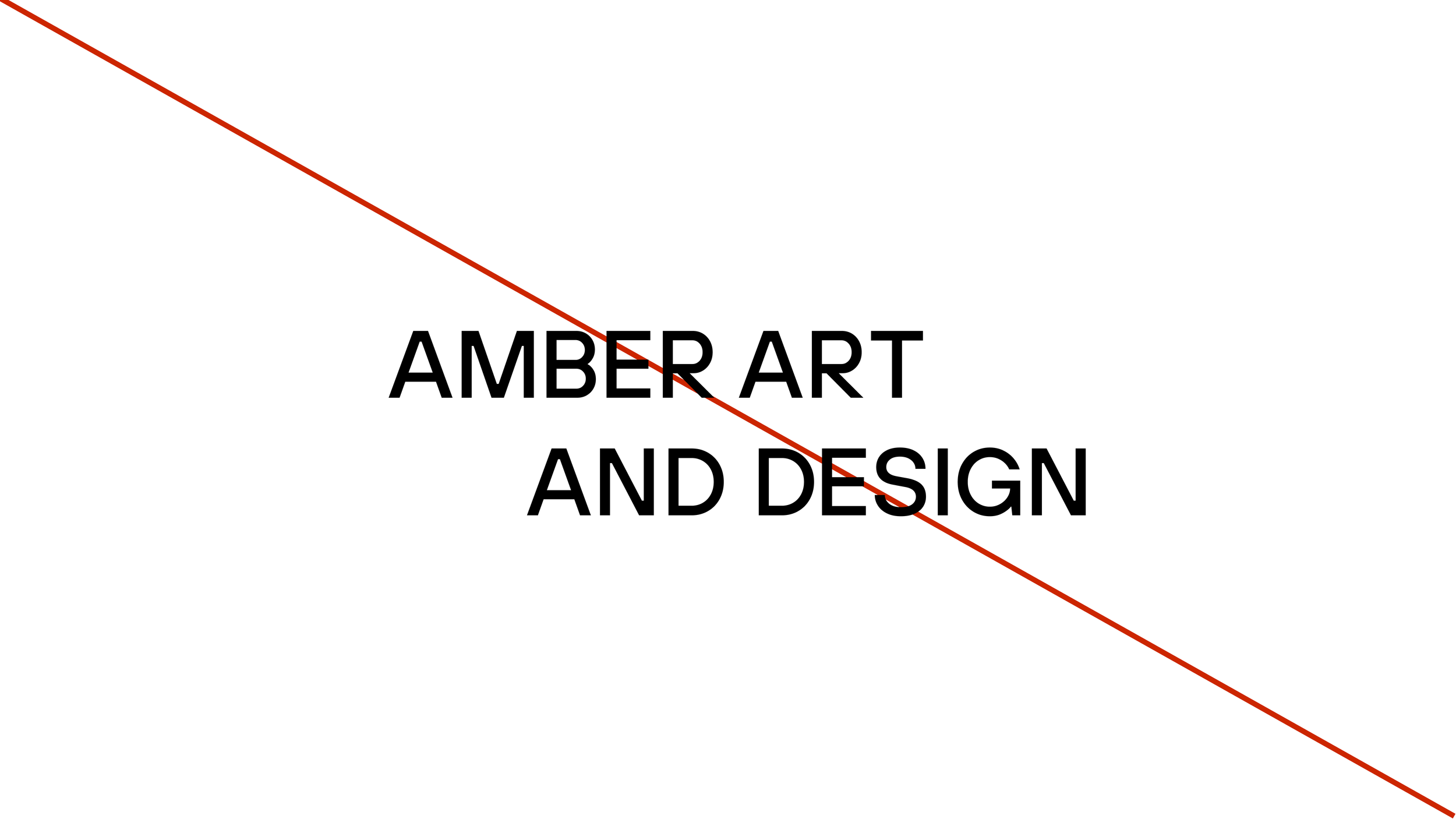
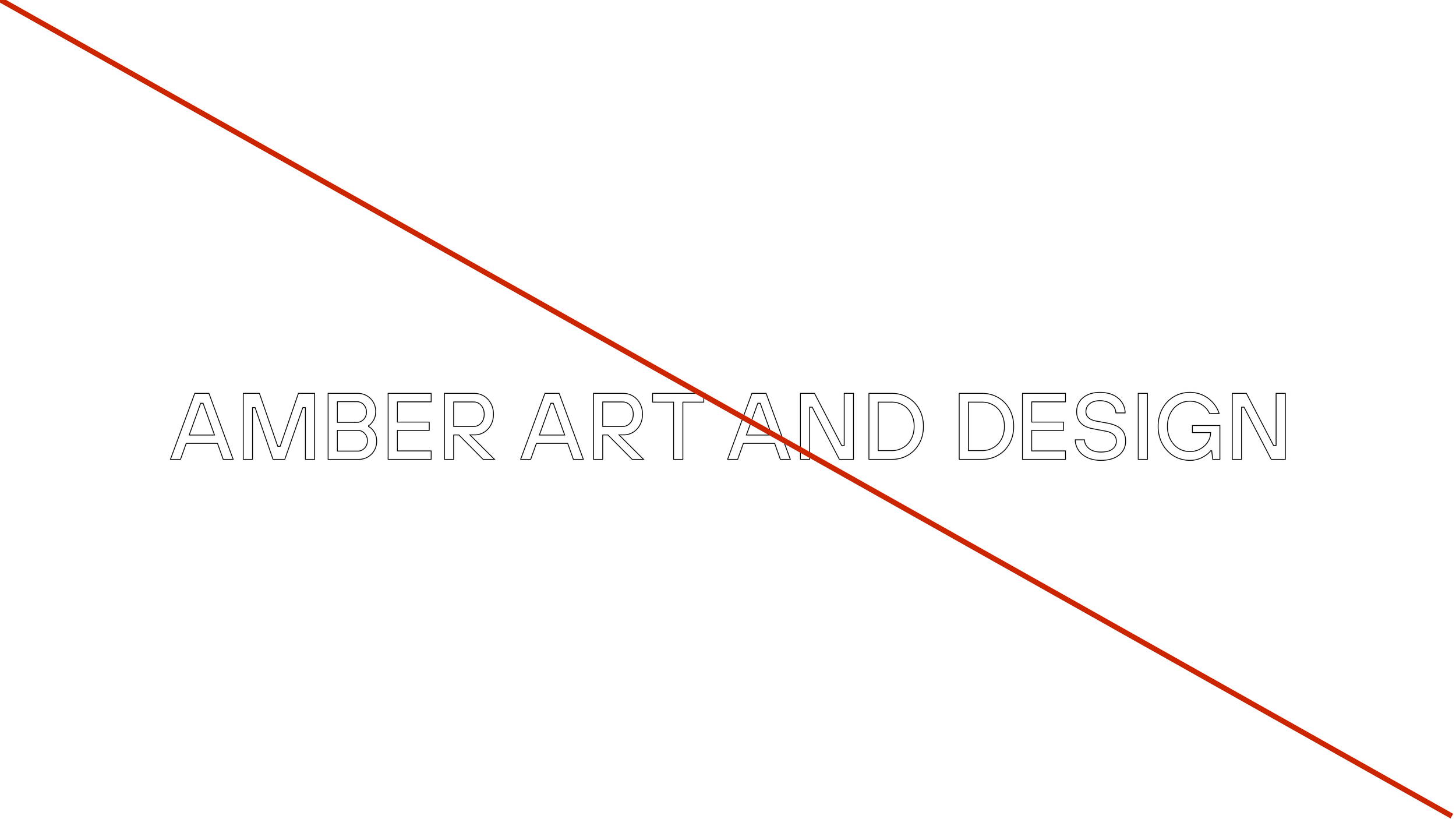
To maintain the integrity of the Amber Art & Design identity, the logo should always be used consistently and as intended. Avoid stretching, rotating, recoloring, rearranging, adding effects, or altering the proportions of the logo. Always use the approved logo files and ensure there is enough contrast and clear space for the mark to remain recognizable.
Don’t Do This
Clear Space
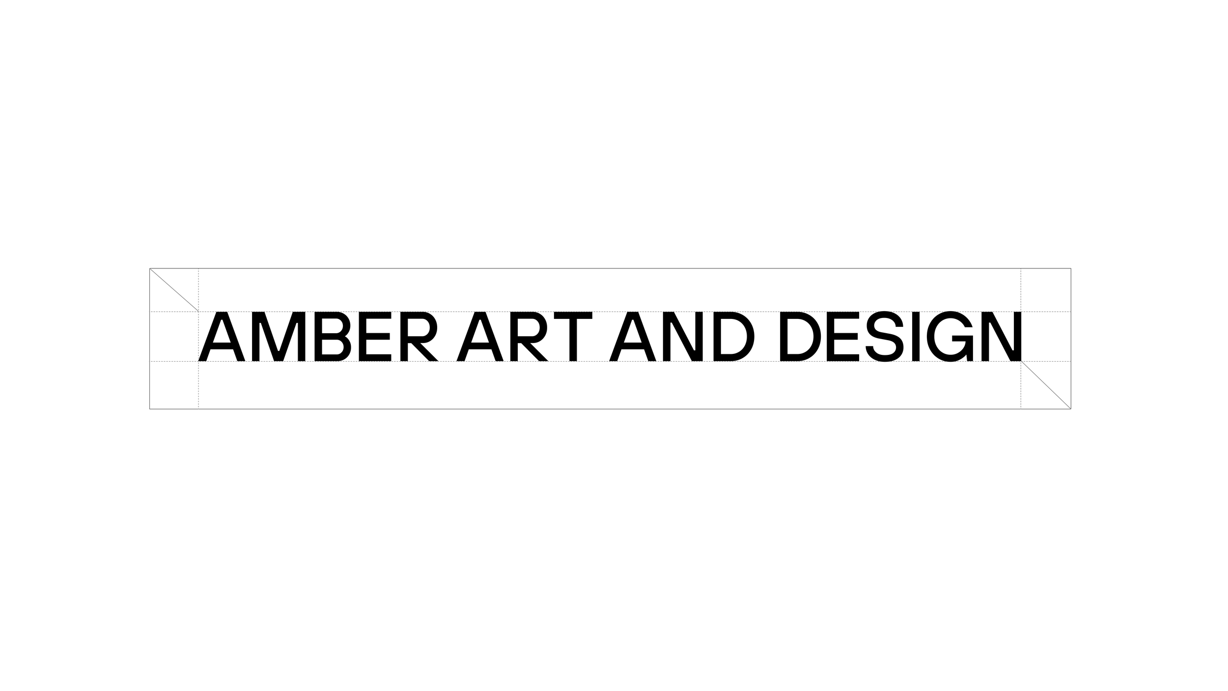
To maintain clarity and visual impact, always allow adequate clear space around the Amber Art & Design logo. This area should remain free of text, imagery, graphics, or other visual elements, giving the logo room to stand on its own and remain recognizable across all applications.
Logo in Color
When placing the logo on a colored background, select the appropriate light or dark version to ensure the mark remains clear, legible, and consistent across all applications.




Secondary Logo / Mark
The secondary logo mark offers a simplified expression of the Amber Art & Design identity. Designed for flexibility, it can be used in applications where the primary logo may feel too large or detailed, while maintaining a clear connection to the overall visual system.
Color Palette
Existing color palette remains a core part of the brand’s visual identity. The colors bring warmth, energy, and character to the system while creating continuity between the organization’s established presence and its refreshed digital experience.
Amber Glow
HEX: #FA9217

Concrete Light
HEX: #D9D9D9
City Gray
HEX: #999999

Mural Charcoal
HEX: #444241

Gallery White
HEX: #EAEAEA
Public Black
HEX: #000000
Profile Icons
The existing Amber Art & Design profile icon is retained as a familiar and recognizable element of the brand. Its continued use across social media and company profiles helps maintain consistency while connecting the refreshed visual identity to Amber’s established presence.





Typography
Public Sans is the primary typeface used across the brand’s digital and marketing communications. Clean, contemporary, and highly legible, its neutral character allows the content, imagery, and creative work to remain at the forefront.

The typeface is used throughout the website and supporting marketing collateral, including pitch decks, presentations, and other branded materials. Its versatile range of weights creates a clear visual hierarchy while maintaining a consistent and approachable identity across every touchpoint.
Heading 1
37 pt - Public Sans - RegularHeading 2
24pt - Public Sans - RegularHeading 3
18pt - Public Sans - RegularHeading 4
14pt - Public Sans - RegularParagraph 1
15pt - Public Sans - LightParagraph 2
12pt - Public Sans - LightParagraph 3
10pt - Public Sans - LightMonospace11pt - Public Sans - Light